What a Comparison Chart Is Actually Designed to Do
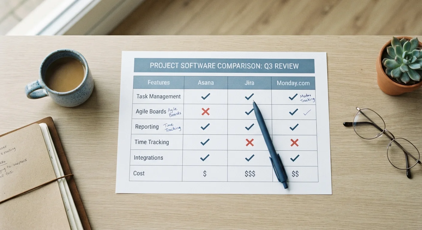
At its core, a comparison chart is a tool for reducing complexity quickly. Instead of reading a full description of every option, you scan a grid: does Option A have Wi-Fi? Does Option B include a warranty? The format is deliberately stripped down so differences become visible in seconds.
That efficiency is genuinely useful - especially when you're trying to eliminate options that are clearly missing something you need. If you require a certain feature and one option simply doesn't have it, a chart surfaces that fast. Think of it as an initial filter, not a final answer.
What comparison charts are not designed to do is explain context, weigh trade-offs, or reflect your personal priorities. A checkmark in a cell means a feature exists. It says nothing about how well it works, how often you'd use it, or whether it's implemented in a way that's actually convenient. For that deeper layer, you need to go beyond the table. See our guide to comparison terminology to decode the language that accompanies these charts.
The Blind Spots Every Chart Has
The most important thing to understand about any comparison chart is that its creator chose which rows to include. Whatever didn't make it into the grid is invisible to you - and you have no way of knowing what was left out unless you go looking.
~40%
Decisions influenced by chart framing alone
Research in consumer decision-making suggests that how options are structured and labeled - independently of their actual merits - can significantly influence which option feels superior, according to studies in behavioral economics.
1 in 3
Shoppers who regret feature-based purchases
Consumer survey data consistently finds that a meaningful share of buyers feel a purchase didn't meet expectations after relying primarily on feature lists rather than hands-on testing or owner reviews.
Common omissions fall into a few categories:
- Quality depth: A row labeled "Customer Support" with a checkmark tells you support exists. It doesn't tell you whether responses take two hours or two weeks.
- Subjective experience: Ease of setup, comfort, or interface design can't be reduced to yes/no. These often matter most in daily use.
- Real-world versus spec performance: Stated specifications frequently diverge from what you'll experience. Our article on spec numbers vs. real-world performance explores this gap in detail.
- Conditions and fine print: A warranty checkmark might mean 90 days; it might mean five years. The cell doesn't tell you which.
Charts also tend to flatten importance - every row looks equally significant in a grid, even when some features matter far more than others to a typical buyer.
“Every table has a perspective baked into its structure. The columns someone chose to include - and the ones they didn't - reflect a point of view, whether or not the creator intended it.”
— Edward Tufte, Information design theorist and author of 'The Visual Display of Quantitative Information'
How to Read a Chart Without Being Misled
Reading a comparison chart critically takes about 60 extra seconds and significantly improves the decisions that follow. Here's what to do:
- Identify the source. Was this chart made by a seller, a third-party reviewer, or an independent publisher? Each has different incentives. A seller's own chart rarely includes competitors' strengths.
- Notice what's missing. Think about what matters to you that isn't a row in this chart. If "ease of return" or "compatibility with what you already own" isn't there, that's a gap you need to fill yourself.
- Treat every checkmark as a starting point. For any row that matters to you, click through or search for specifics. A checkmark only confirms existence, not quality or degree.
- Watch for framing bias. Feature names can be written to favor a specific option. "Advanced security" on one row might describe the same underlying function as "basic encryption" on another chart made by a different party.
Ask: What Row Would Change My Mind?
Before you finish reading a comparison chart, identify one feature that - if it turned out to be missing or weak - would eliminate your front-runner. Then go verify that specific point from an independent source. This single check catches most of the cases where a chart's checkmark doesn't reflect reality.
If you want a structured approach to cutting through chart noise, this beginner's comparison framework walks through a repeatable process you can apply to almost any decision. And if you notice that you keep gravitating toward one option before you've finished reading, it may be worth reviewing how cognitive biases can quietly skew comparisons.
Turning a Chart Into a Decision You Can Trust
The most effective way to use a comparison chart is as a shortlist tool. Run through it once to eliminate options that fail on non-negotiable criteria - the features you genuinely cannot do without. What's left is your working shortlist, not your final answer.
From there, weight the remaining rows by how much they actually matter to you. A feature that appears in every row of a chart carries the same visual weight as a deal-breaker - but those two things are not equivalent to every reader. Building a personal comparison scorecard lets you assign that weight yourself rather than accepting the chart's implicit ranking.
Also consider what a chart structurally can't show: long-term satisfaction, ownership costs over time, or how an option performs for people with your specific use case. Price comparisons deserve the same skepticism - our piece on why price-only comparisons backfire covers why the lowest number in a column often isn't the lowest total cost.
Used as a filter rather than a verdict, a comparison chart is a genuinely useful tool. The problem arises when the tidy grid creates an impression of completeness that the underlying data doesn't support. Staying aware of that gap puts you firmly in control of the decision.